As a follow-up to my article on how to create the perfect ‘about us’ page, I thought it would be useful to look this week at what makes a good product page. Any business owner with an ecommerce site will know the importance of having a well put together product page, and here are my top 5 tips for how to ensure your visitors don’t get turned off when they make it to the product level of your website.
1. Keep Descriptions Concise and Relevant
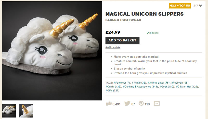
When people have reached your product page, you don’t want to bore them with a big chunk of descriptive copy, but a brief, factual and gently persuasive description may be just the push they need. The tone and style needs to be tailored towards your audience – I quite like the playful tone used by Firebox in the example below, but what works for them will not work for everyone.

2. Use Big Call To Actions
Okay, I’m ready to hit the purchase button – don’t make me hunt for it. Too many product pages have an add to cart button which is either too small or too far down the page to be easily visible. The button itself should be big, colourful and clear.
3. Avoid Too Many Distractions
Normal best practice for websites dictates that you should make it as easy as possible for users to navigate from page to page on your website. The exception to this rule is the product page – once you have users here, you want them to click on that buy button, not visit your facebook page or read your latest blog posts (however interesting they may be). Keep your product page as minimalist and uncluttered as possible (the Green & Blacks page below is a good example).

4. Minimise Page Loading Times
In order for users to trust your site enough to enter their card details and spend money on it, everything needs to run smoothly, particularly as they progress towards the transaction stage. If your product page takes forever to load, then that puts doubt into the shopper’s mind – will the site crash when I try to make a purchase? And will I still get charged?
For this reason it pays to keep your product pages as basic as you can – a big, extravagantly designed page may look great, but you could lose out on sales as users will take only seconds to get bored of your unreponsive site and go elsewhere (just look at how simple the Green & Blacks product page is).
5. Establish your Credibility
For a new customer, purchasing on a website (unless it is a famous, recognised brand) is something of an act of faith. You can help them feel more comfortble buying from you by emphasising the things the show you are a reputable company – reviews, testimonials, social media shares, and product guarantees.
Experiment with the above tips and your own ideas, and use Google Analytics to see what happens to your product page bounce rates and conversion rates. Let us know how you get on!


