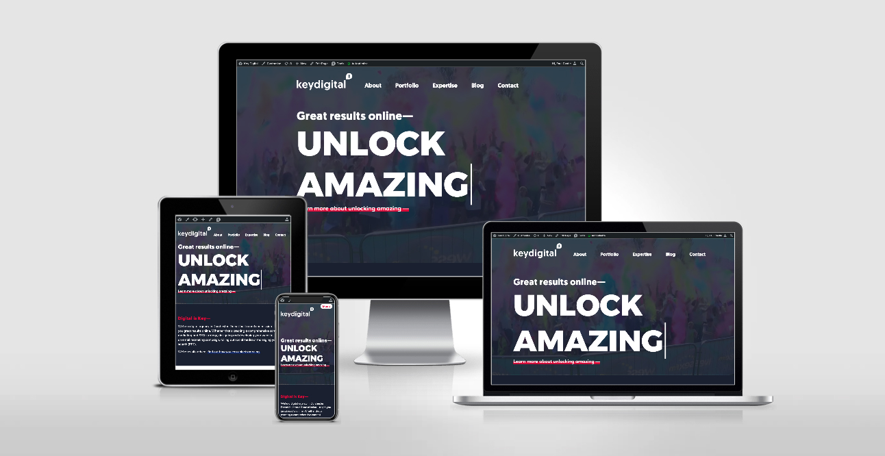
See how your site looks on desktop, laptop, iPad & iPhone with our responsive website tool
Show off how responsive website design looks across different browsers easily with this 4 in 1 viewport tool.
Each device displays a fully working, scrollable website which can be picked up dragged around the page so that you can focus on one at a time.
Try it here: https://design.key.digital/responsive

What did you think? Was your website responsive on all devices or did it fail to live up to your expectations? If not, we can help!
The benefits of responsive website design
Responsive design is the development of a website so that it automatically scales all of its content to fit whichever screen width its displayed on. Therefore, content and images can be easily read and viewed on mobile devices, without any unnecessary time taken to consume it. There are also a number of additional benefits to consider:
- Websites generally load faster if they are responsive, this has SEO benefits with the potential to increase your page ranking and lower your bounce rate
- Google drives 96% of mobile search traffic and recommends responsive design as a best practice
- There’s no more pinching, zooming or side scrolling with a responsive site
- A responsive website design provides a positive user experience regardless of which device is being used
- Allows a business to put its best foot forward and keep one step ahead of the competition
Get in touch with our team of website design and development specialists to find out how we can build you a fully responsive and bespoke web solution.